GRIND Banking
100% Black Owned
GRIND Banking is a 100% black-owned debit card and mobile banking company designed to build financial tools focused on bringing advantage, education and support to African Americans as well as all underserved and inner city communities.
Date
2019
Role
Branding, Web Design & UI, Web Development, SEO Strategy
Challenge:
We took over the task of marketing GRIND Banking. At the time, the GRIND Banking product had already launched despite the fact that the brand identity wasn’t fully flushed out. In an effort to help overcome inconsistencies we set out to define the guidelines and refresh the website. Traditionally, banking corporate identities are conservative and sterile. We wanted to incorporate character into our identity based on vibrant, expressive black culture and exude a sense of confidence, boldness, and innovation. Color, contrast and proportion were all considered in the process. The designs needed to stand out and not feel too cluttered or overly dated.
Color:
Blue
#00AEEE
Yellow
#F3F100
Black
#000000
White
#FFFFFF
Typography:
POPPINS SEMIBOLD
ABCDEFGHIJKLMN
OPQRSTUVWXYZ
0123456789
- Primary Font
OPEN SANS REGULAR
abcdefghijklmnopqrstuvwxyz
- Secondary Font
- Font Body
Web Design & UI:
In addition to refreshing the website with the new brand identity it was important to attract consumers into signing up for a GRIND Banking card. There was a lot marketing language to be included on the site, and therefore was imperative for the information to be organized and presented in a way that was digestible, and easy to interact with.
We started by a doing a competitive audit of sites of other financial products. The greatest takeway from this research was the importance of a simple design and the user being able to navigate easily through the site without being bogged down with extraneous details. A solution to this problem would be to have a persistent call to action button in the top right corner so the user could click to get a card from any time on the page. Whenever financial products are involved, there always comes with a long list of required legal language. In an effort to hide some of this language, and maintain the cleanliness of the site, we developed rollover effects so the text would only show when hovered over or clicked.

GRIND Banking Sitemap:
Wireframe Sketches:


Desktop Website:


Mobile views of homepage


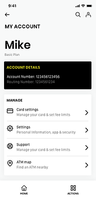
The GRIND Banking app was to be developed and maintained via our partner program manager. We quickly realized after the initial walkthrough of the app, that at some point in the near future we would need to take control of the design and backend technology in order to get the app in a great place for our users.
As time permitted, I attempted to make some progress on that endeavor so when the time was right we'd already be ahead of the game. In coming from my previous employer, Green Dot, I had already done a lot of research in the traditional and Fintech banking spaces. We had extensive data on the market, the target audience, and the competition, which for this brand there really wasn't any other companies playing in the space. In the end, the goal of the next version of the app was to use the existing flow as a baseline and look for potential ways to enhance the user experience and simplify the process. The project has been an ongoing process and still in the designing phases.

Select app screens


GRIND Banking has been recently featured in various news and media outlets including press releases from the following comanies:

We ran email campaigns to try and drive awareness for the brand and get the word out. The following is an example for one of those. With the help from the team with imagery and icons, I was able to lay out the foundation of the email and code for mobile responsive.


